"Wuzz, the 'magic sticker,' stands as one of PARKEE’s premier products. This innovative sticker, when stuck to your headlight, enables seamless entry and exit from parking spaces without the hassle of rolling down your window to make payments via ‘traditional’ card or cash. At designated gates, the sensor recognizes your sticker, and lets you in. Similarly, when exiting, the sensor identifies your sticker, charges the parking fee through the PARKEE App, and lets you out of the parking area.
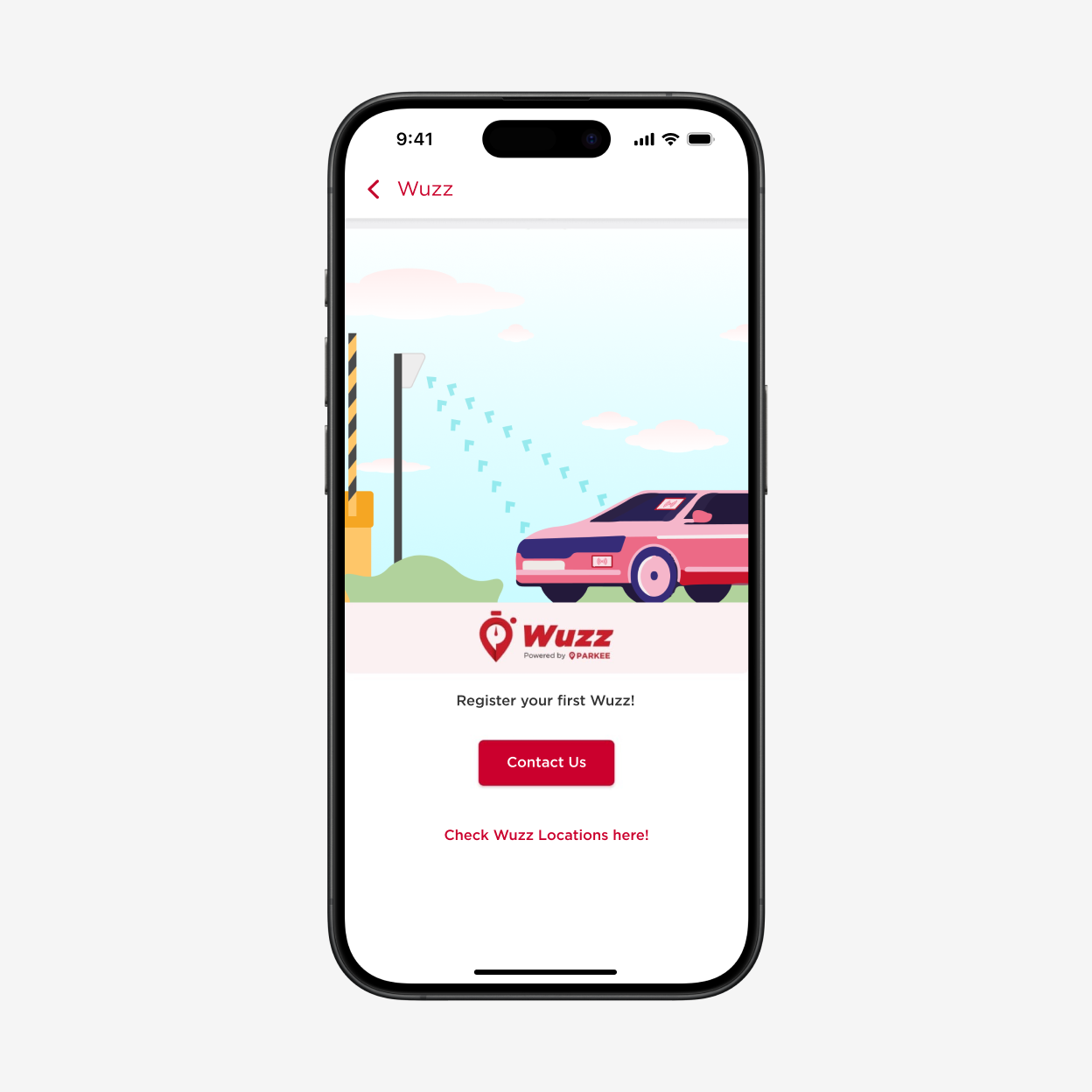
When opening the Wuzz menu, we are greeted by a simple onboarding page and a CTA to ‘register your first Wuzz’. However, the onboarding page appears to lack key information about this premier product.
This was confirmed with our initial test with respondents who are not familiar with Wuzz. From this test we realized that:
After exploring the page, 100% of respondents still don’t understand anything about the product.
80% of them won’t even check the locations. Most of them said it’s because they don’t even know what’s the product about
80% states that they are actually curious and will consider ordering if there is some information available on the page.
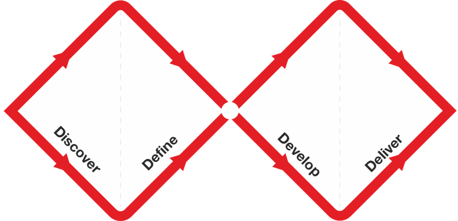
We are using double diamond design thinking as a framework to approach the design. The Double Diamond is a visual representation of the design and innovation process. It’s a simple way to describe the steps taken in any design and innovation project, irrespective of methods and tools used. (source: designcouncil.org.uk)
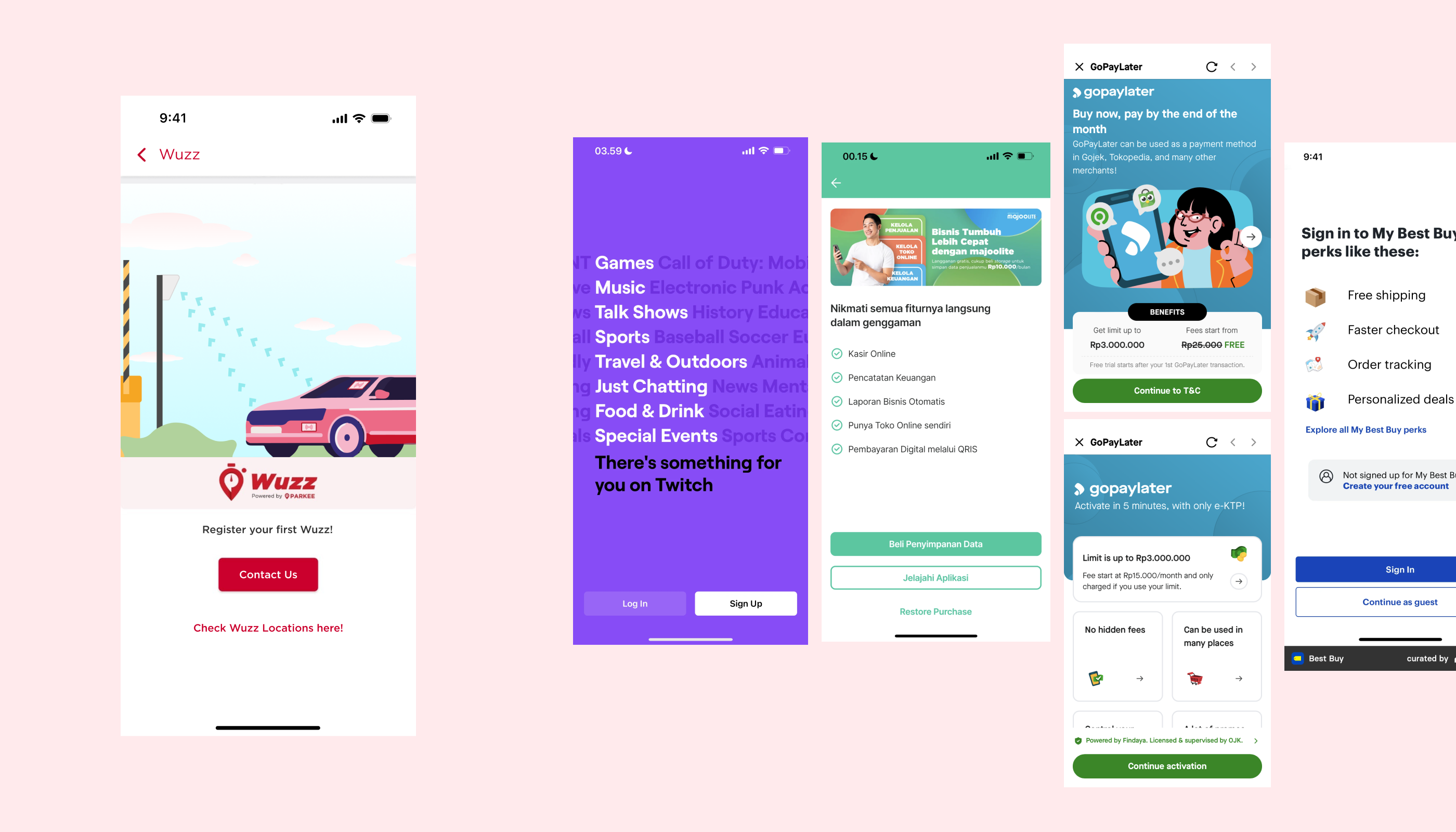
Benchmarking on other apps, our initial onboarding page fell short in providing sufficient product details. Many other apps effectively use their onboarding pages to introduce their products.
Learning from other apps, we gather some interesting aspects that we can carry to our onboarding page.ons.
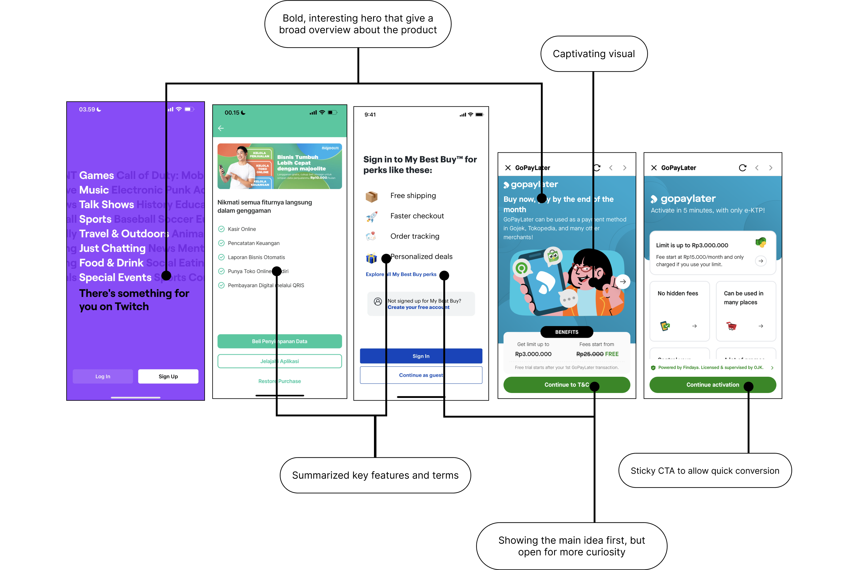
Based on the initial test, users need more information about Wuzz to understand its value and how it works. Building on that and learning from other apps, our feature onboarding page should address these needs by
Start the page with bold, interesting hero and give broad overview about the product
Highlighting key features
Incorporate visual illustration that supports product overview
Having realized the opportunities, we aim to improve the page with this in mind:
How might we design a landing page that informs users about Wuzz and encourages them to order?
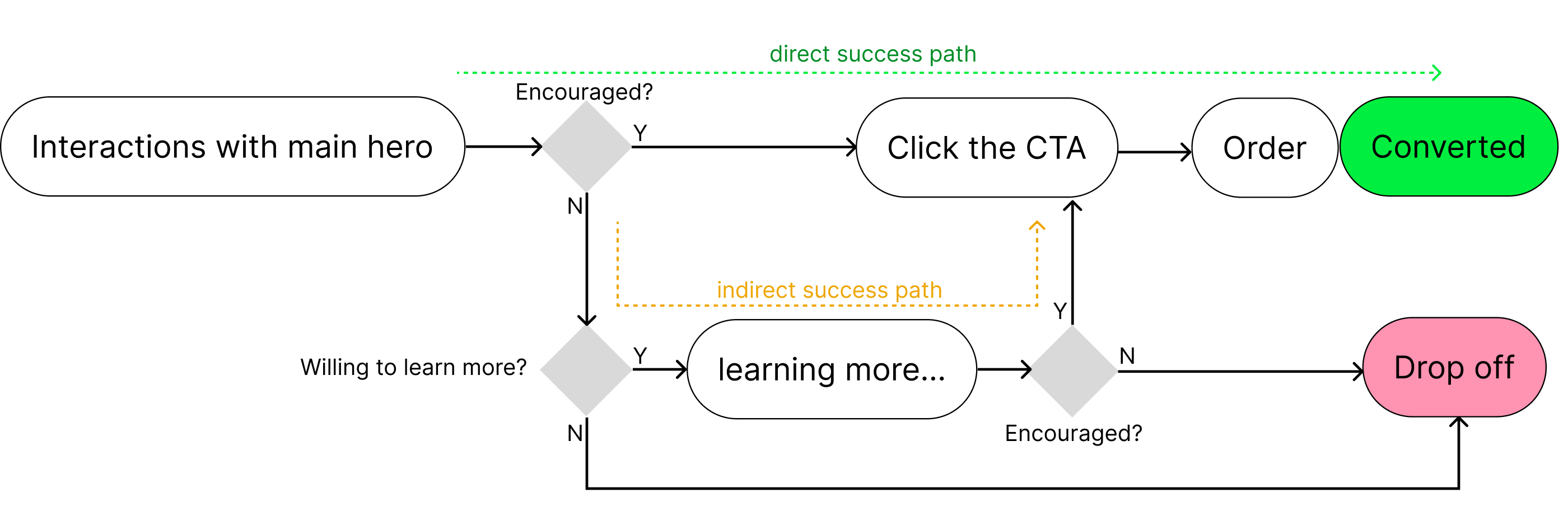
The ideal user journey occurs when users engage with our key value propositions and immediately convert. In addition to these core offerings, we'll also provide supplementary information such as installation instructions and location availability.
After exploring numerous concepts through rough designs, we refine our ideas until we arrive at a final concept. This chosen concept clearly communicates our three core value propositions using a carousel format. The carousel also allows us to incorporate large, engaging illustrations for each point, effectively showcasing Wuzz's distinctive features.
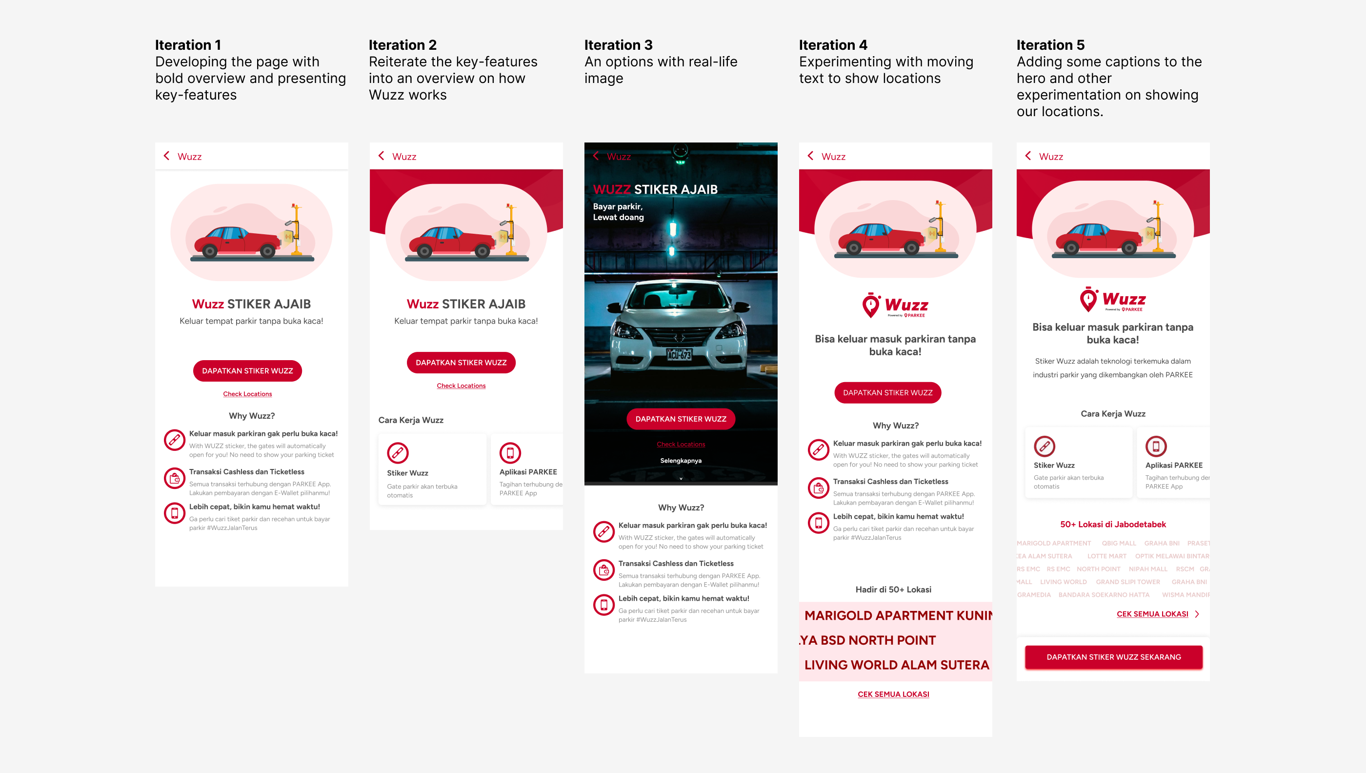
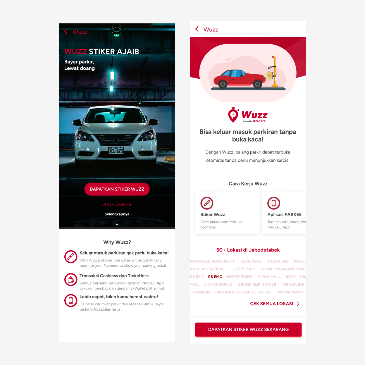
After making several iterations, we conducted a design review and selected two options to be tested. We selected Iteration 5 which was a refinement of previous iterations. We also include Iteration 3 which was an experimentation and have the most radical difference against other iterations.
After we come up with several concepts, we want to validate them. We gathered a number of users to interact with our selected concepts. The goal is to validate whether users feel informed and encouraged to order the sticker or to learn more. We also aim to gather user’s feedbacks, preferences and suggestions.
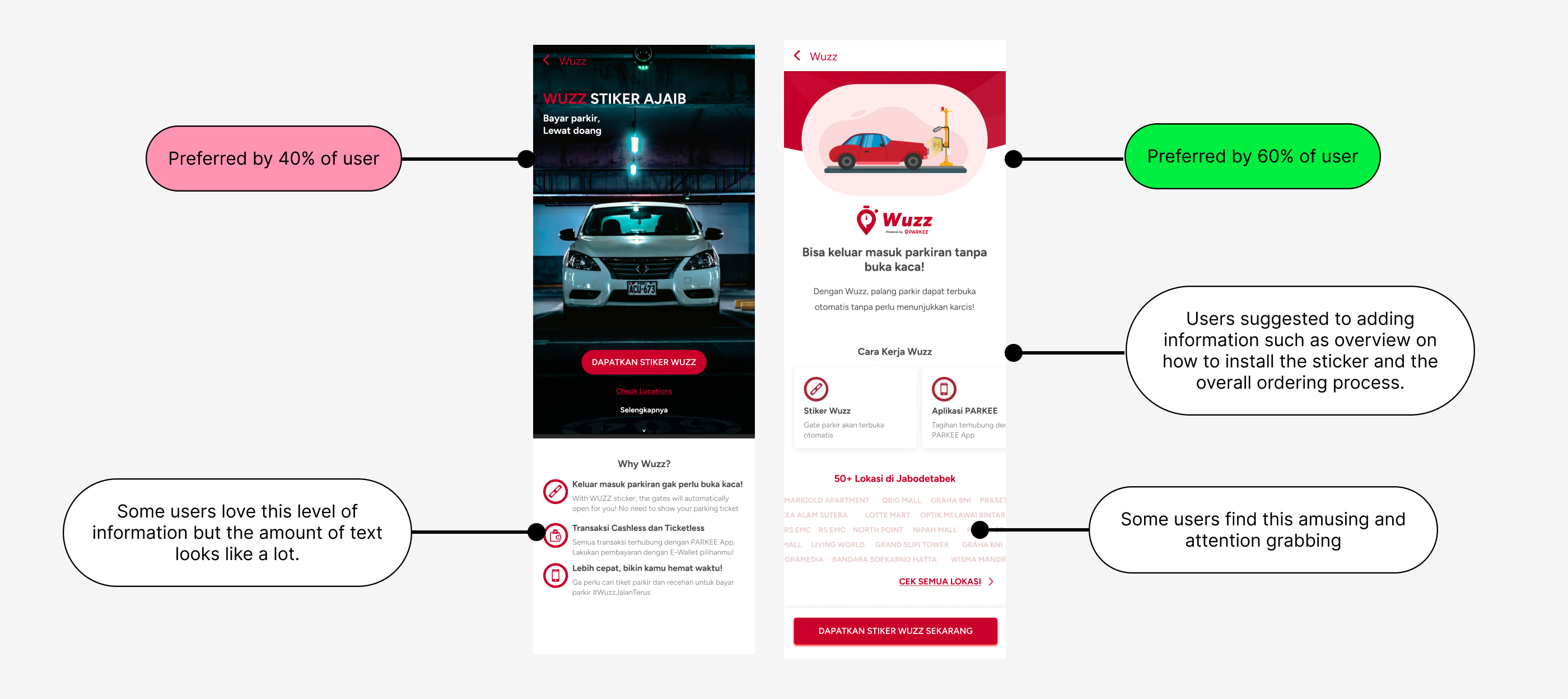
After testing the concepts to users, we found that our concept has successfully helped users to feel informed (80% of users) and even encouraged them to order Wuzz (60% of users). Through listening to their thinking-out-loud during interaction we also gather insights and suggestions. Generally, the users are enticed and prefer our latest iteration (60% of them). Others find the “Why Wuzz” Section on the 3rd iteration to be informative but they were noting that the information looks like a lot to read. They were suggesting adding some information such as an overview on how to install the sticker.
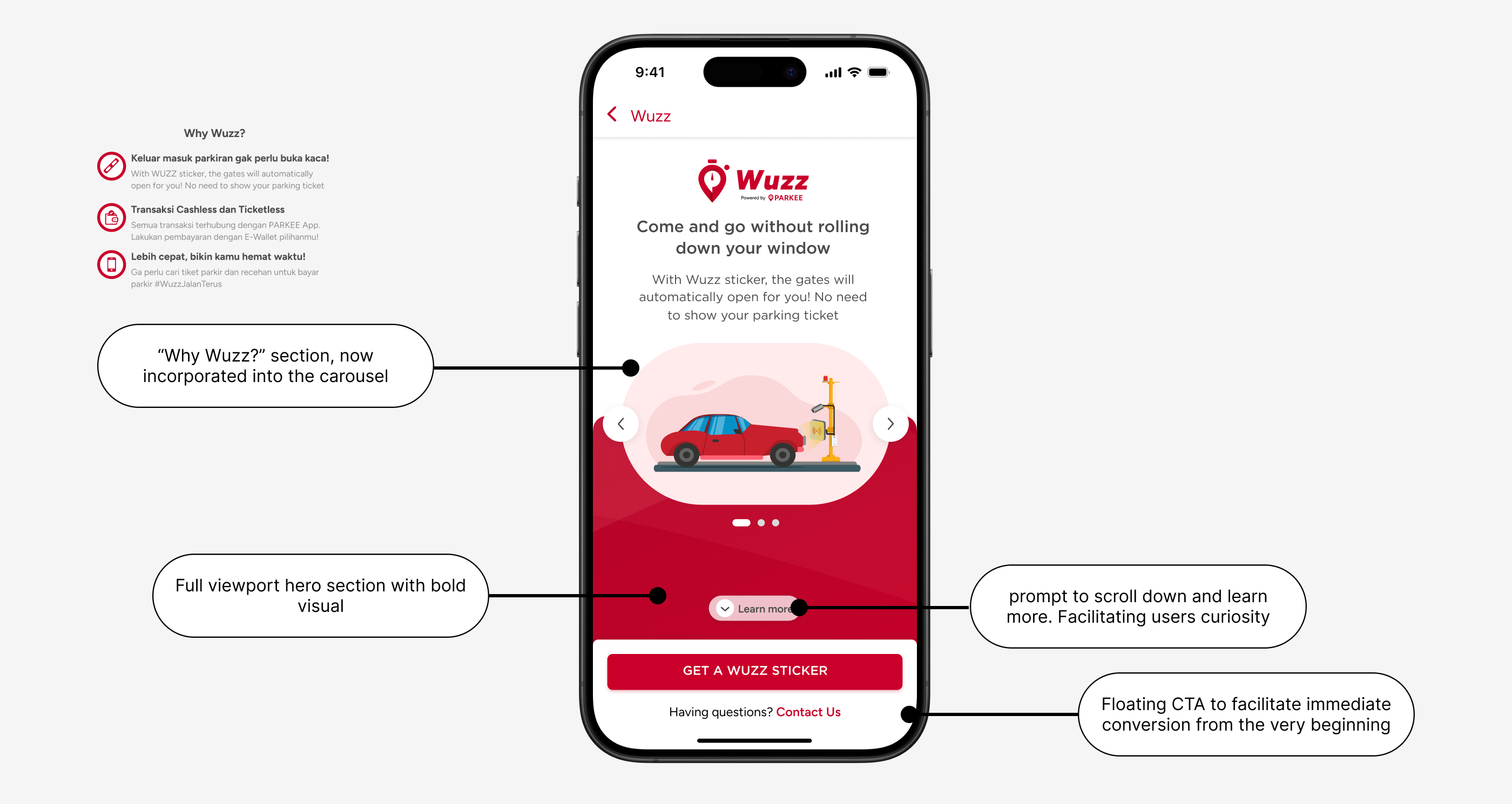
After conducting the test, we can now refine our design to be more suitable to user’s needs. This refined concept clearly communicates our three core value propositions (previously “why Wuzz” section) using a carousel format. The carousel also allows us to incorporate large, engaging illustrations for each point, effectively helping showcase Wuzz's distinctive features.
Flex the good stuffs first 💪
We show our best value proposition with captivating visual illustration at the very first look (credits to Hanif Abdurrahman ).
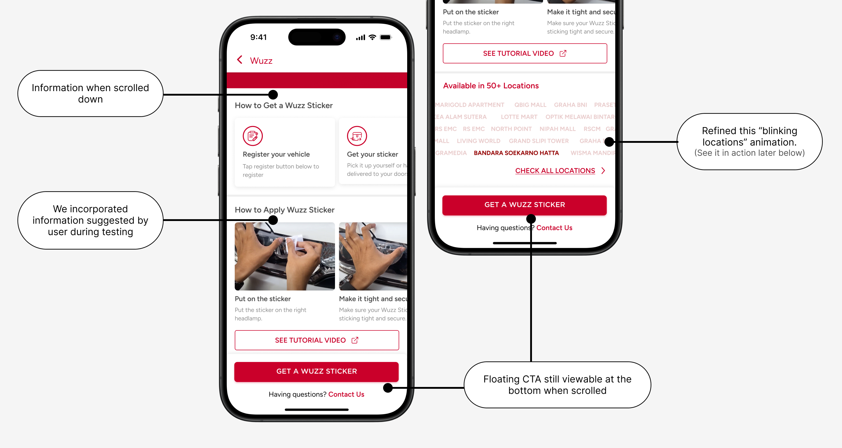
The CTA to order the sticker is also visible. This will encourage people to convert right-away after seeing
the best value proposition.
Not encouraged yet? There’s some more!
Even when showcasing our strongest value proposition, users may still require additional information. Therefore, we provide supplementary details like installation instructions and location availability.
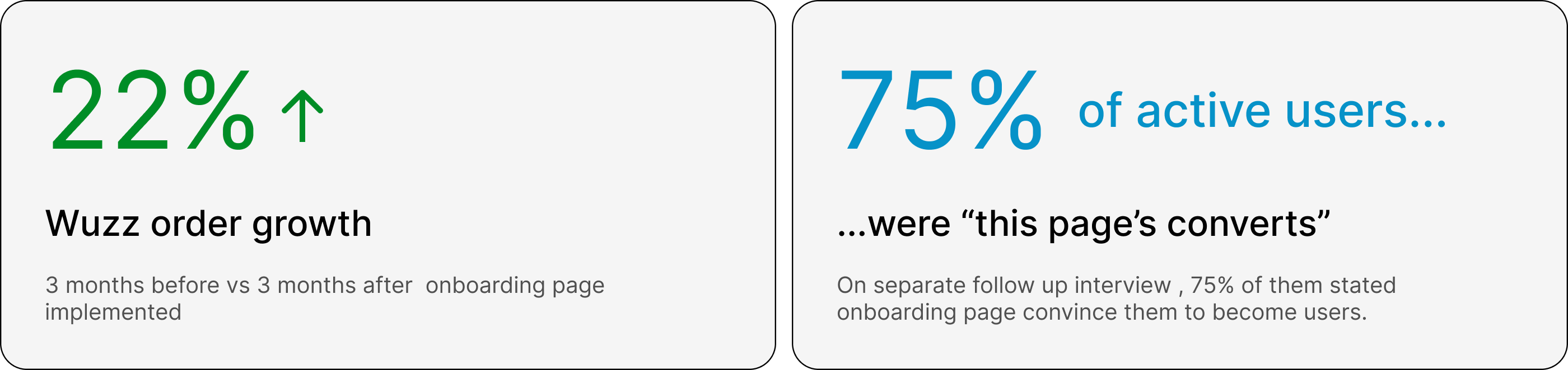
Comparing the three months before and after the onboarding page deployment, Wuzz Sticker orders showed a 22.4% increase.
In a separate interview with active Wuzz users, 75% reported that the onboarding page helped convince them to become users.